My parents have been flipping houses long before my brother and I came into the picture. Their most recent project was a craftsman home that they built on an acreage in Lake Country. It has a Modern Farmhouse aesthetic and I LOVED being apart of the design process. Most specifically, the kitchen.
The kitchen to me is the heart of the home. And I’m not just saying that because my family is Italian. Whenever I get asked about where one should invest in a renovation or new build, my answer is the kitchen. Always and without a doubt.
It is also where my family congregates throughout the holidays. If not loading our plates with food, we’ll be sipping and eating along the counter or kitchen table. As such I tend to measure up a kitchen as to how it’ll withstand during the seasons of entertaining, with an ever-growing family.
kitchen layout
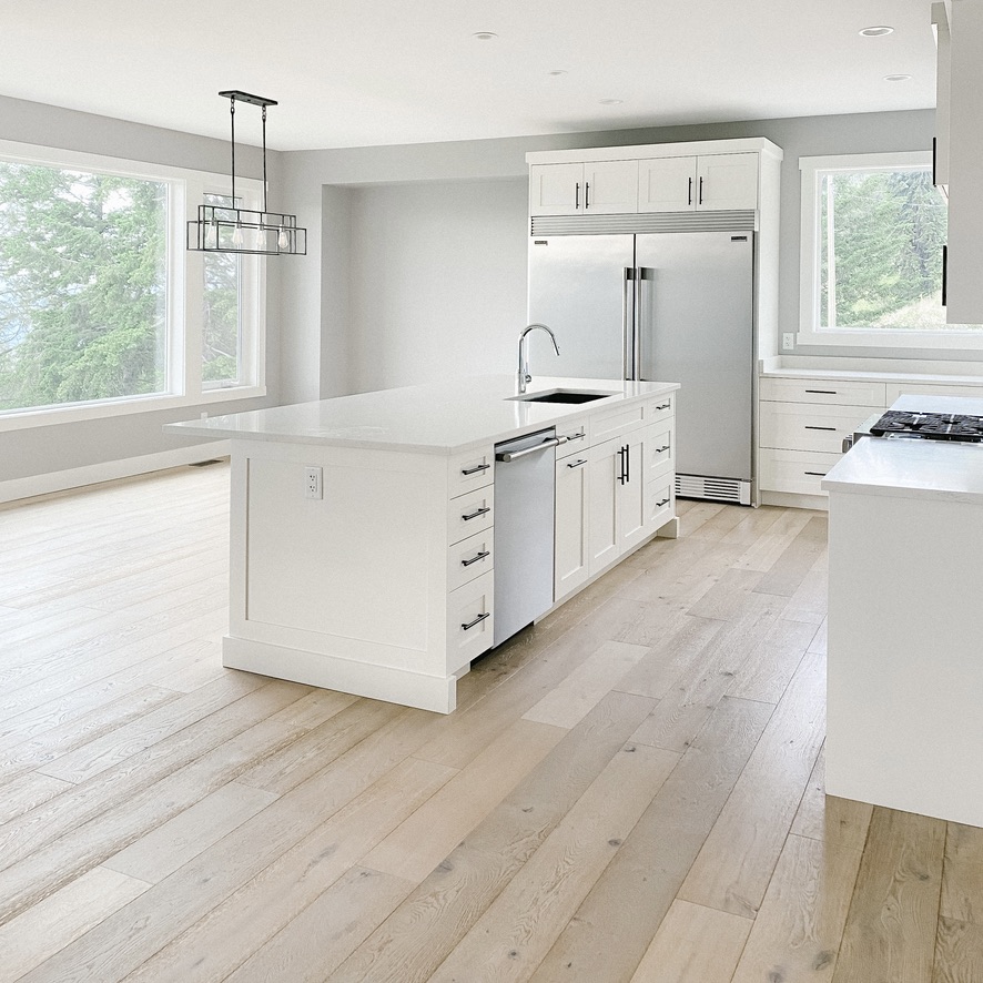
While the layout of the kitchen is an open concept, these are the key sections to note:
- island (sink + dishwasher)
- stove + counter
- walk-in pantry
- prep station/bar
- fridge + freezer
- island (bar)
- dining room
The kitchen also opens up into the living room and deck.
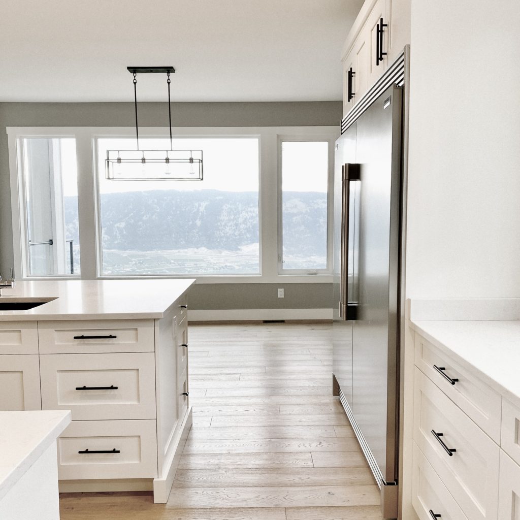
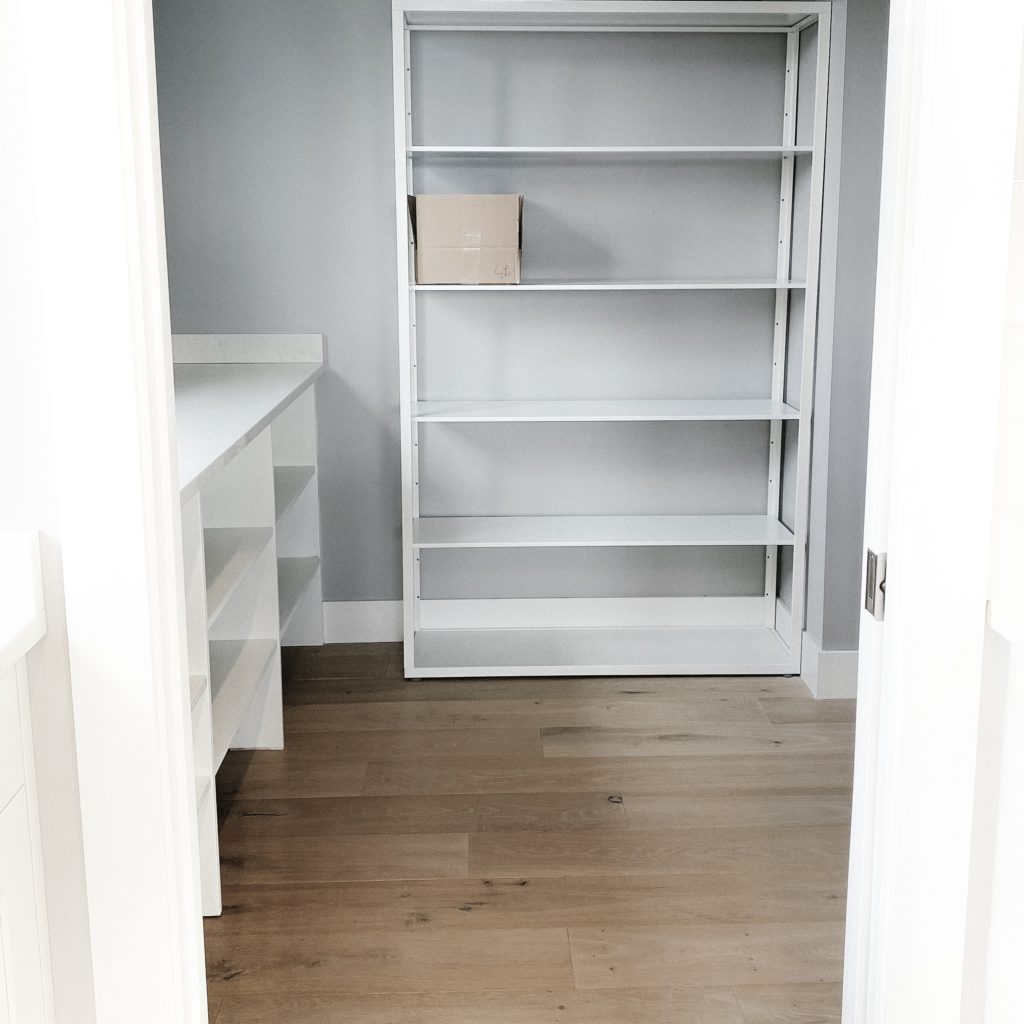


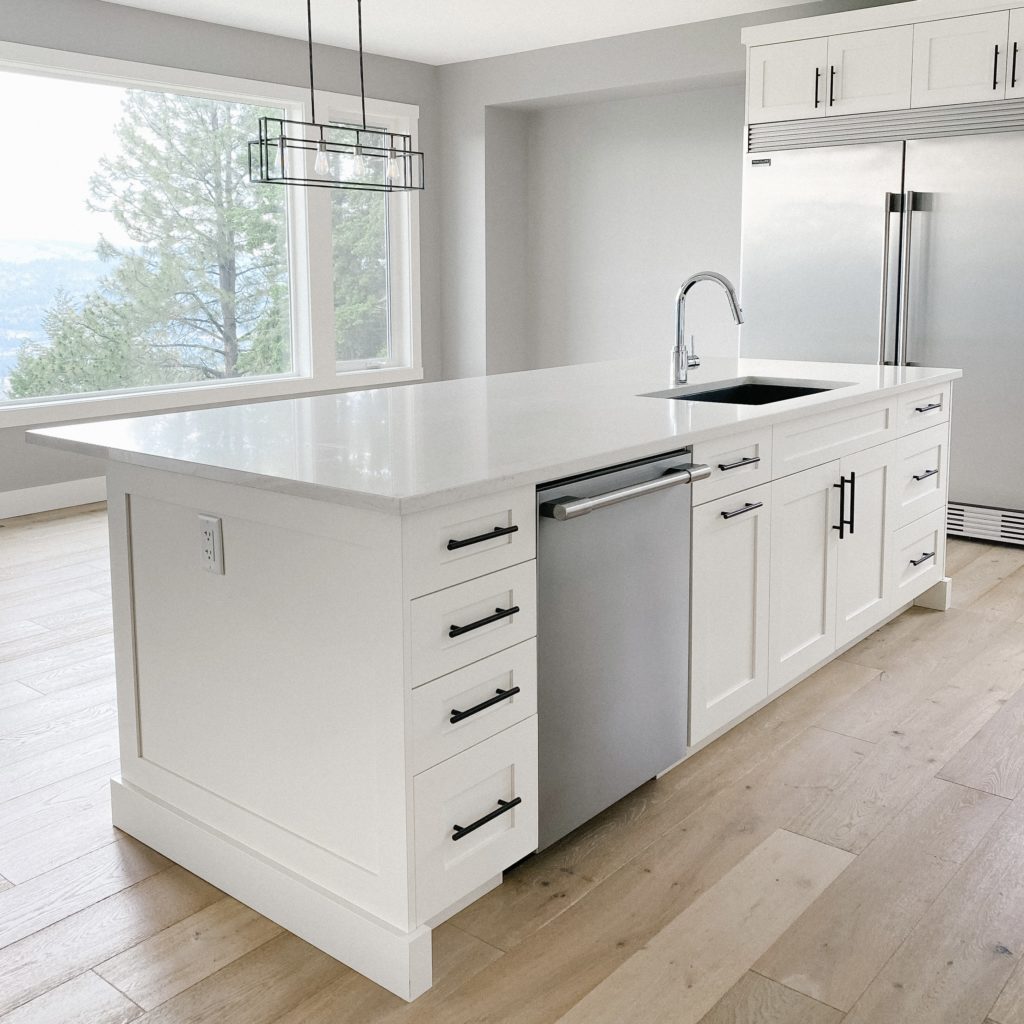

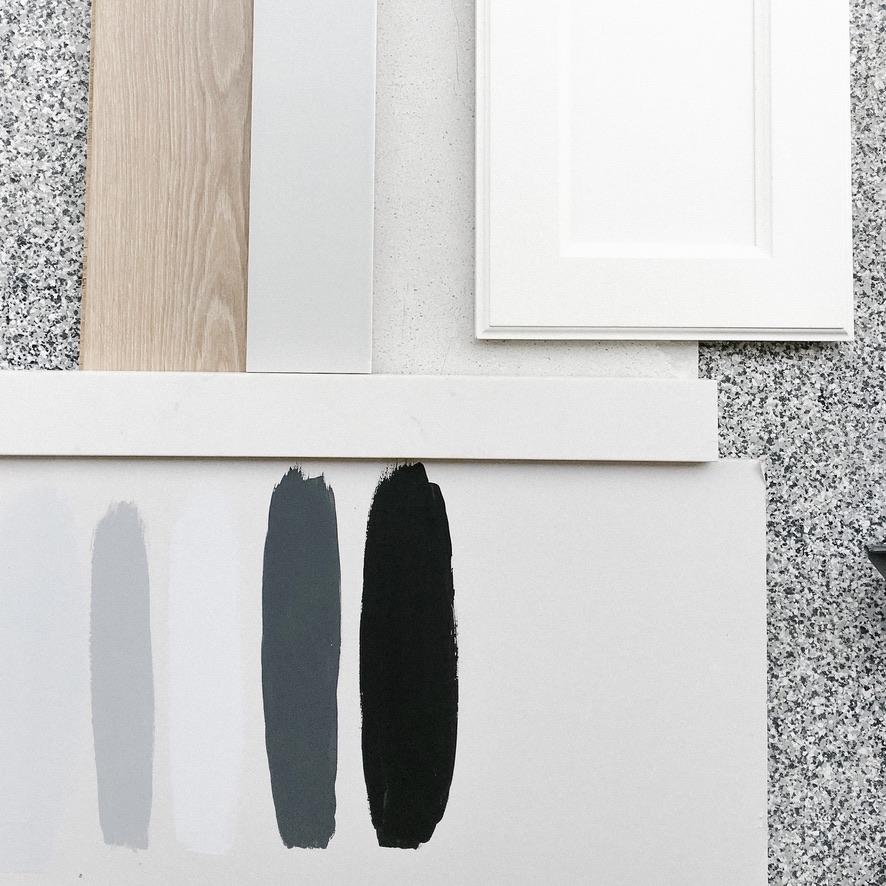
Style Notes:
island
The kitchen may be the heart of the home, but the island is the heart of the kitchen. Well, at least in my family it seems to be. It is where we gather all through the year.
Growing up in our family home, my brother and I basically lived at the kitchen counter. This was despite the fact that our dad built us each a desk in our own rooms.
On that note, you really can’t have too big of a kitchen island. Especially if it is a giant slab of white quartz, which I am shamelessly obsessed with. Even though I only really use it a few times a year.
The quartz is an absolute dream to bake with and super easy to clean. If cooking or baking brings you even the slightest amount of joy, I would certainly consider the investment.
From Canada Day to Christmas Dinner, I am confirming that the kitchen counter passes the holiday entertaining test.
cabinetry
I really love white cabinets in a kitchen and was SO happy when my dad agreed to the white shakers. It’s such a timeless and versatile look and I honestly could do them in every home.
The white has a bit of a warmer undertone, which helps warm up the cooler grey tones from the walls and backsplash.
There was a bit of a debate about the hardware, but I am glad that my parents went with the minimal matte black. As much as I love the black and white contrast, I really want to explore a brushed nickel for the next home.
wall colour
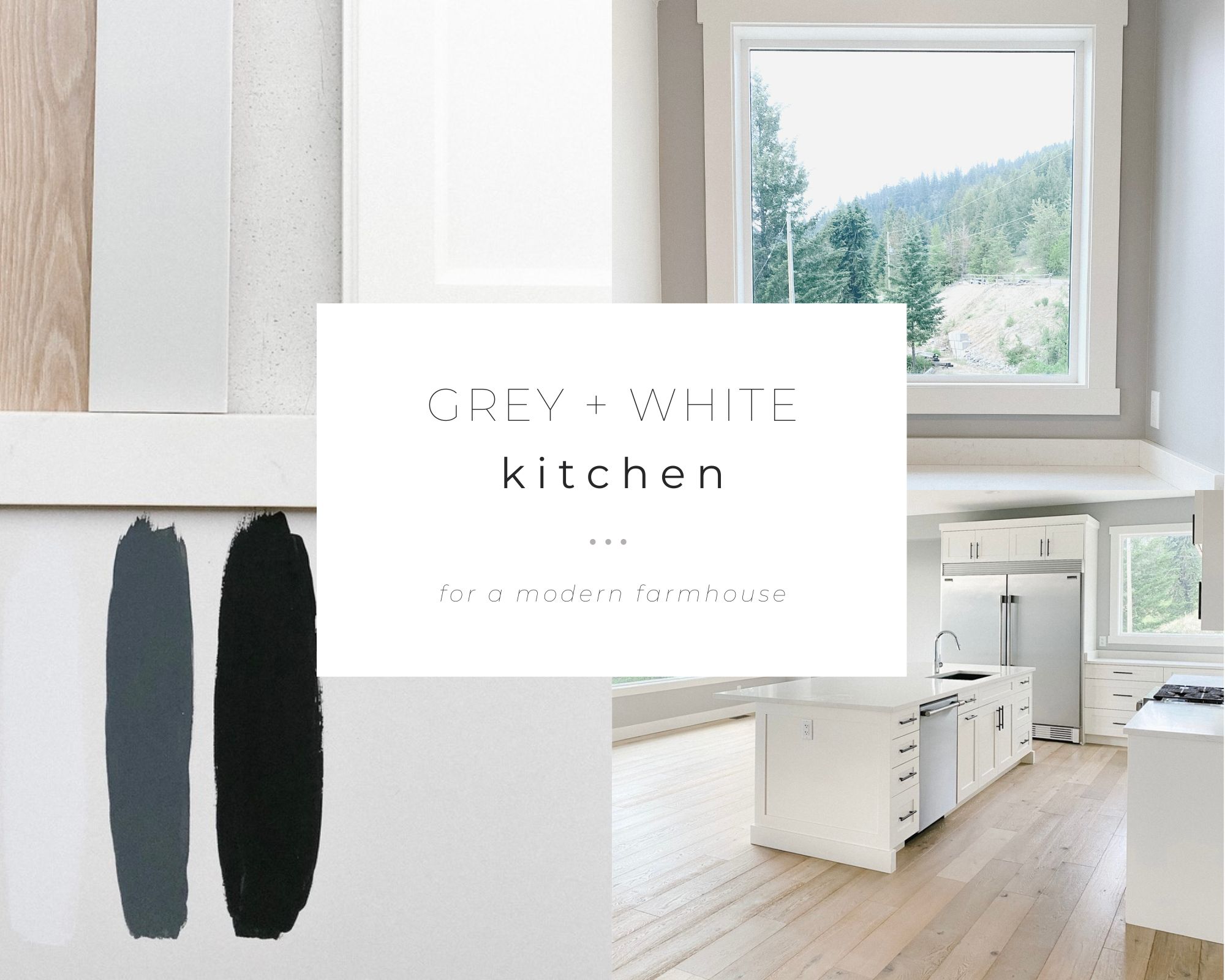
For the wall paint colour we ended up diluting a lighter grey at 50%. I highly recommend doing this if you want to tone down the colour saturation while keeping the shade and undertone.
I honestly would’ve gone even lighter, but my parents were a little hesitant about going too white. It seems that they have warmed up to the idea since. I would love to see a very soft off-white-grey throughout the next home.
backsplash
The tile chosen for the backsplash, behind the stove counter, was a very light grey subway tile. It was light enough to not get lost in the paint but dark enough to play off of the grey veins in the white quartz countertop.
flooring
I’m honestly obsessed with the hardwood flooring. It is gorgeous and has been super durable. It even withstands my dad’s work boots.
The subtle grey within the wood really helps tie in the cool and grey undertones that are present throughout the home, while slightly softening it up.
recommendations
- contractor: Valley Craft Homes
- backsplash + hardwood: Smalls Tile & Flooring
- windows: Ply Gem
- appliances: Coast Appliances
- sink: Baths by Design
You can visit my pantry post or kitchen board on Pinterest for additional Modern Farmhouse kitchen inspiration.
JESSICA. xx
[…] This one was my favourite. […]